Wrapping up 2020, it’s clear that the past 12 months had a significant impact on businesses worldwide. Between lockdowns and changing consumer behavior, entire industries have had to adapt. Growing your brand should be on your radar in 2021.
But have all these developments been for the worse? Well, that depends on how you look at things.
If you’re a leader who’s agile and flexible, you’re in the perfect position for growing your brand in 2021. Firstly, you can jump ahead of the competition by conducting extensive market research and listening to what consumers want. You can also adopt the relevant trends and innovate in the right places.
And, perhaps, you can employ color to boost your brand’s visual identity and set your business apart from the competition.
If you’re interested in aesthetics on your website, here are all the trends to keep on your radar for 2021.
Pantone 2021 Color Schemes & Expected Marketing Trends
On December 9, 2020, Pantone announced their colors of the year 2021. This was the first time in two decades that the company featured two choices for their brand instead of the traditional one. But what’s interesting is that the global authority for color communication issued an insightful statement that supported their decision.
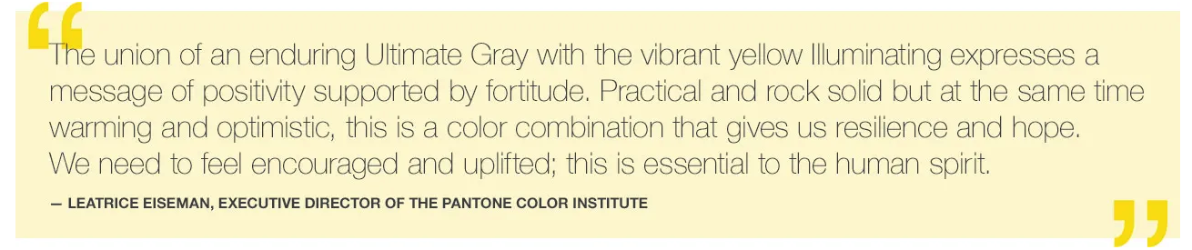
By combining contrasting hues that denote resilience and optimism, Pantone sent out a clear message. Amidst a world of anxiety, we all need a dose of positive in the period to come.
With this in mind, entrepreneurs and marketing leaders need to start thinking about the approach they’re going to take in the upcoming period. Should they focus on flash and promise, or should they go back to the basics of branding?
Well, according to Deloitte, the marketing changes businesses can expect in 2021 pertain to purpose, connection, and engagement. Not only do they show evidence that consumers are shifting towards brands whose values coincide with their own. Even more, they’re predicting the main ways for businesses to succeed in the upcoming period.
What they point out is engagement, inclusion, and trust-building.
Website Color Schemes and the Post-2020 Consumer Mindset
Seeing that the most prominent marketing leaders have made their declarations on what entrepreneurs can expect in the coming period, this may be the perfect time to approach a website redesign.
Deloitte’s data-based predictions are sure to remain relevant in the foreseeable future. Moreover, they rely on branding-related concepts. This makes them perfect for those looking to grow their business.
The best piece of advice for those willing to adopt a new appearance in favor of growth is to look for ways they can combine innovative or popular visual directions with the essence of their brand.
This is particularly well done on the homepage of the Frans Hals Museum in Haarlem, Netherlands. It appropriately uses a bright yellow header section combined with bold black lettering. But the thing is, the design choice isn’t the consequence of following trends. It’s an expression of their mission to let “people look at, and think about, art differently so as to question existing and established perceptions, and to constantly suggest new and alternative ones.”
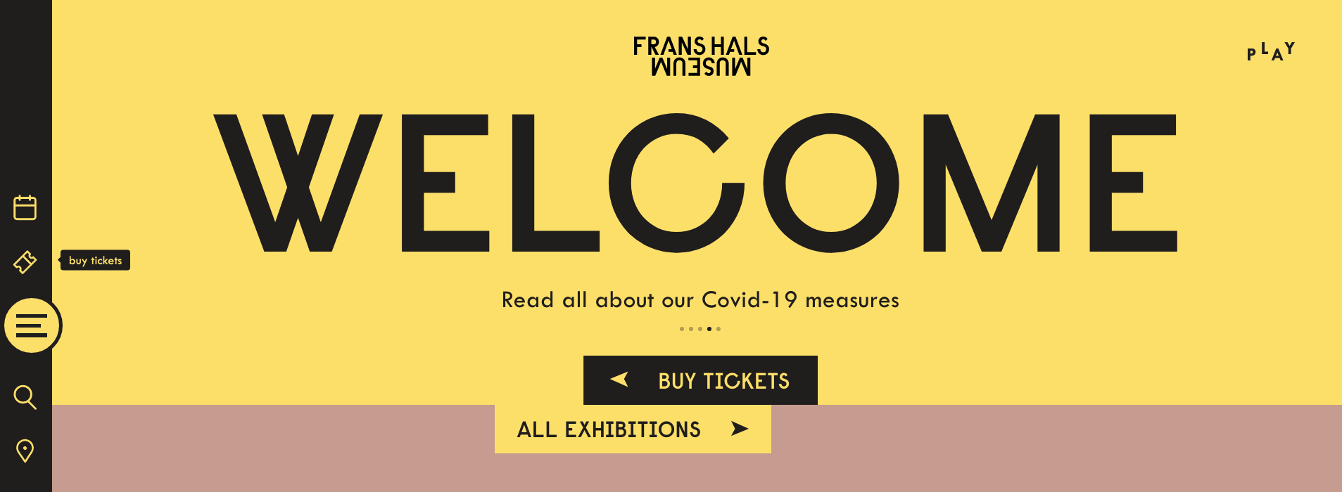
From this idea, we can deduct that, instead of going for a particular look because it’s fashionable, brands need to think about how web design and color schemes represent and serve their mission.
Communicating Intent & Values with Color
If you’re an owner, leader, or employee at a more commercial business entity, you may be wondering: how can businesses, especially those in the ecommerce industry, adopt these philosophies in 2021?
The great news is: you don’t have to copy and paste the same look to be on-trend. Instead of flushing your visual identity down the drain, why not think about ways to enhance and upgrade it to something more 2021-esque?
For example, Medical Alert Buyers Guide hit the nail on the head by adding a link to their homepage that tackles transparency. Coloring the sentence in a blue that contrasts with the background, they’re far from blindly following Pantone’s advice. Nonetheless, they’re still making a statement.

Similarly, SomniFix is addressing the issue of growing distrust towards brands by making small adjustments to their social proof page. Building on an otherwise monochromatic look, they’ve added two highlight colors to the page. These draw attention to the fact their reviews are left by verified buyers, following the increasingly popular aim of building trust and growing their brand.

Alternative Visual Directions for the Future
Now, although it may be tempting to follow the currents and base your design choices on the values propagated by others, the fact is, this may not be the best direction for your growth.
After all, it’s entirely possible that your audience isn’t looking for an optimistic or close-knit community. Your potential buyers may be after a hard-hitting product or service they can imprint their own identity on. With this possibility in mind, two popular visual choices from previous years will remain highly relevant in the coming period.
The first is going to be the minimalist web design many have already adopted. Not only is it an excellent choice for ecommerce, but it also presents a blank canvas that brands can modify to their wants and needs.
If this is what your current website design relies on, you can make small updates, as seen on the homepage of Mannequin Mall. By changing their header image and adding pops of red to the most valuable links, the brand has made adjustments that remain true to its visual branding but are adapted to contemporary consumer behavior.

Website Colors
If you’re insistent on using the colors of the year for growing your brand in 2021, you can easily make the changes with your design team, ensuring that you’re fashionable in your choice of color schemes.
Facebook, on the other hand, decided to make much more significant changes in 2020, adopting a dark theme for their desktop site, clearly inspired by the rising popularity of the aesthetic embraced by Android and Apple in the past two years.
Like the white-background minimalist direction, this look is also a solid choice for brands looking to cater to consumer needs. That’s especially the case for those who expect the majority of traffic to come from mobile or to happen later during the day.
Going Beyond Current Fashion
The one thing to keep in mind if you’re going after growth is that web design trends tend to change every few years. Brands are quick to adopt the latest fads, which often results in most websites looking strangely uniform.
For this reason, it’s not a bad idea to consider your company’s identity before making any radical changes. Sure, you can incorporate color, layout, and typography trends in your online presence. But don’t let them define your visual identity.
After all, the ultimate goal isn’t being the winning brand of 2021. Instead, it’s to build a reputation and stay relevant for years to come.